
KEEP IT SIMPLE STUPID!
In my first lesson with Alan Martin he told me that his master Max Meldrum, had rated different painting subject matter in order of difficulty. He maintained that copying a set of abstract tonal shapes from one canvas to another was the easiest, followed by Still Life, Flowers, Portraits and the most difficult Landscapes. Landscapes were rated thus due to the changing conditions, light, weather, interruptions etc. All of the others could be painted in controlled light and their level of difficulty determined only by the subject’s ability to remain still. As to the selection of subject matter, Alan maintained that the KISS principle (‘keep it simple stupid’) should be applied.
Leonardo Da Vinci has been quoted as saying ‘Tis better to paint a fish in the market place well, than an archangel badly’, a fifteenth century KISS principle I guess, but I wish to discuss the art of landscape painting in this blog. This is an area of painting that many students find so difficult that they resort to working from photographs. This method of painting can be sterile and misses our the joy of working in the great outdoors and communication with, as a Japanese acquaintance of mine once called, ‘the natures’.
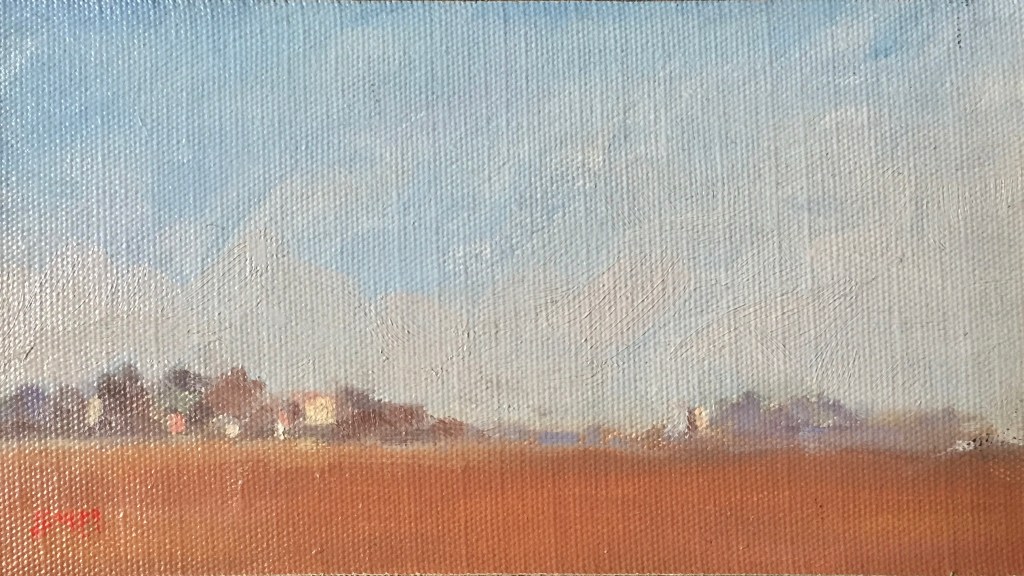
To quote Alan Martin, and most other painting teachers of note, ‘A painting is merely a set of shapes!’. Alan took this further with regard to landscapes saying ‘The majority of landscapes are a set of horizontal stripes and a few vertical disturbances. I think the example above ‘Fallow Ground Italy’, shows this, being basically two major horizontal stripes with a minor one in the centre, broken into smaller vertical disturbances. You cant get much simpler than that.
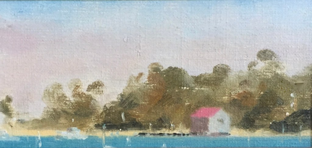
‘Merimbula’ above takes this idea further being four major stripes with the verticals being self explanatory.
If there is a so-called trick to this method of visual perception, it has to do with initially seeing less rather than more. The best way to do this is to half close the eyes which in effect generalises the shapes and eliminates the detail. Doing this with the above painting and looking for the biggest difference between the subject and your white canvas you can readily see the first task ahead, which in any ‘tonal’ painting is to separate the lights from the darks. Obviously the upper stripe is a light and the balance resolves itself as a dark with a few relatively light disturbances near the bottom including a yellowish minor stripe and a squarish light mark about a third in from the right. The bottom blue stripe could be considered a dark at this stage.
Now, here is the tricky bit. Our white canvas will serve for our lights for now, but what do we use to suggest our darks? My advice is that it doesn’t matter much what colour you use but the tone only needs to be darker than your canvas and the paint, when applied needs to be, as Shirley Bourne would say, ‘…dry and scrubby dearie’. In other words you need to have the surface of the canvas such that you can place your carefully mixed tones on it without changing their values due to the underpainting.
Painters have many ways of mixing tones but my way, which came from Shirley Bourne, is to start with the darkest dark and work my way, tone after tone up to the lightest light. I have written extensively about mixing tones and colour before and most teachers and painters have their own methods so I won’t go into detail here but suffice it to say that I generally do not touch my canvas until I have a full set of tones mixed and compared on the palette prior to placing them on the canvas.
The tones should ideally be applied to the canvas, using the biggest brush possible, in strict order of importance or getting rid of the biggest difference between the subject and the canvas. This difference can be determined by once again half closing your eyes and comparing your work at all stages with the subject.
The need for objectivity is critical for the realist painter. You may have noticed that in the above discussion there was no mention of skies, trees or buildings. One must at all times attempt to only see the shapes in the subject and not the things. Max Meldrum has said that the painter should see the subject as if it is a painting and make the painting look like the subject.
Remember, IT IS JUST A SET OF SHAPES.
Don James 23rd January 2022
Those who wish to find more information on this subject will find it in my book
ON PAINTING Contact me at james143@ozemail.com.au

HI Don, so happy to see your article about Keep it Simple, after such a long time. When I went to the exhibition yesterday to see the Wayne Leslie collection, that was the overall impression that I got about good painting. I even made voice notes on my phone about it because previously I was thinking how I would ever approach outdoor painting, as it seems so difficult and full of visual detail.
LikeLike
Thanks again Leonie. All true!
LikeLike